Galavibe needed a brand identity that could keep pace with the high-energy, multi-sensory environment of modern festivals. The challenge was to create a visual system that felt electric and communal, capturing the "vibe" of a gala while remaining bold enough to stand out in crowded festival landscapes. We needed to bridge the gap between organized event management and the raw, spontaneous energy of live music and celebration.
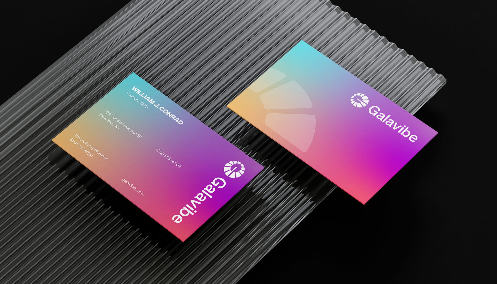
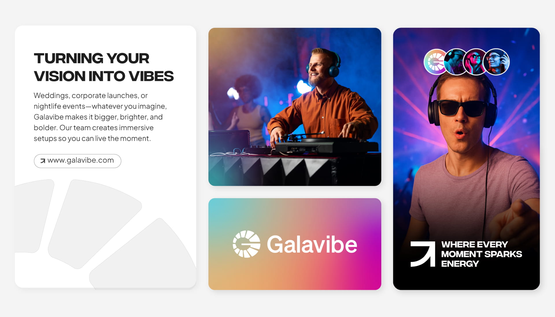
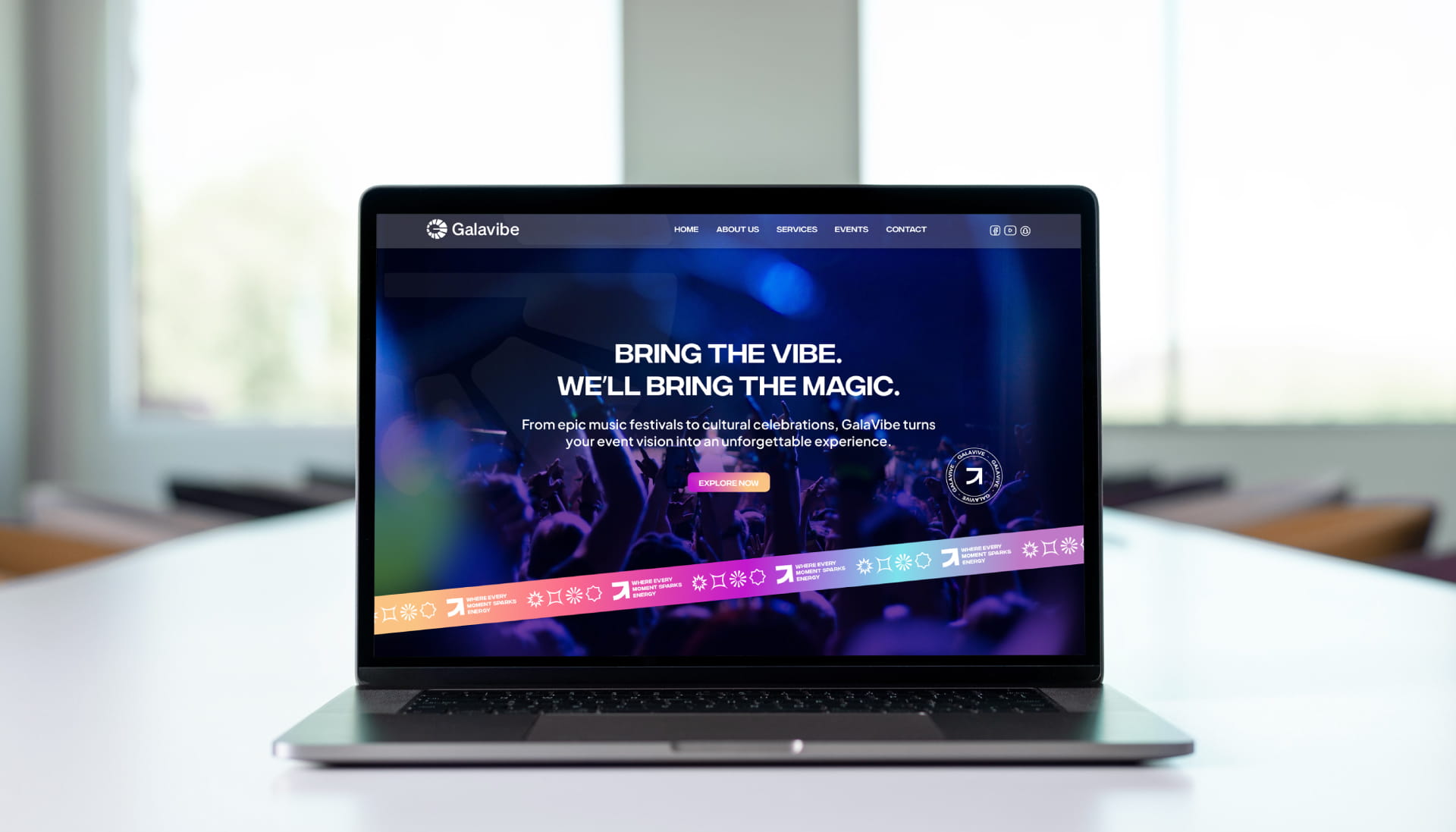
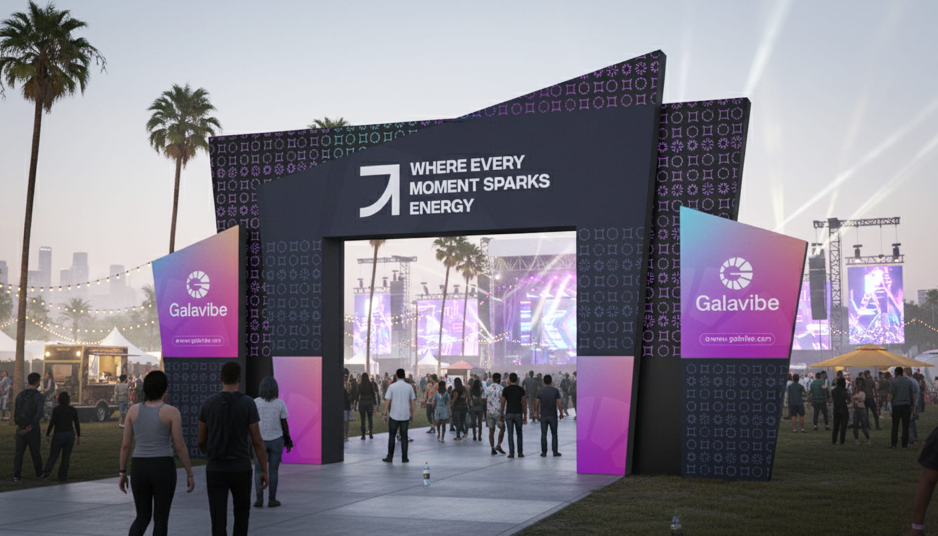
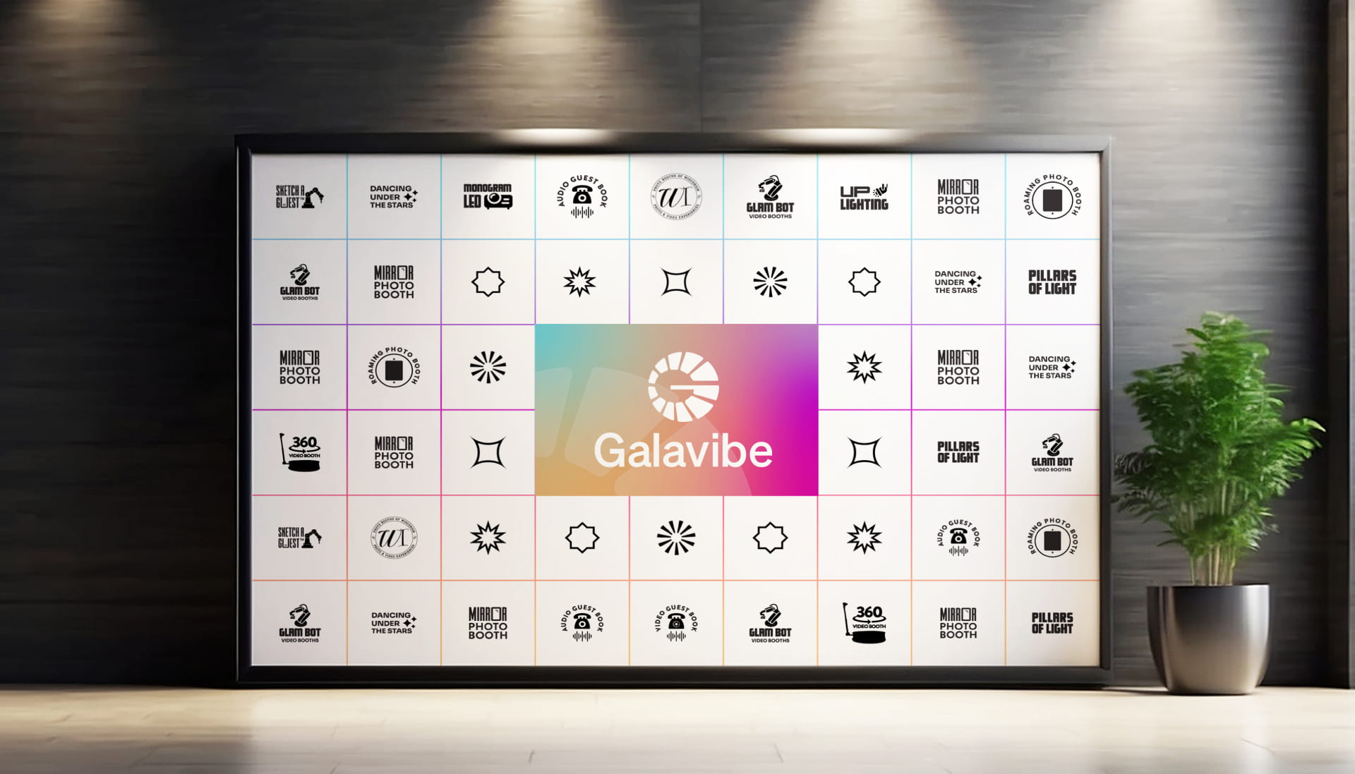
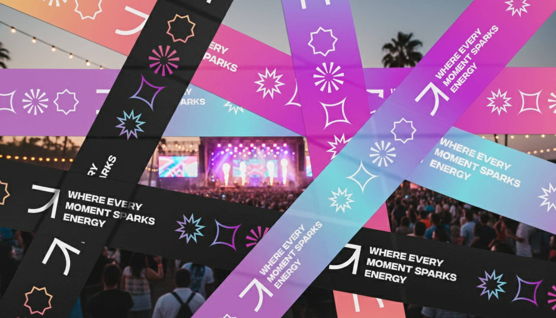
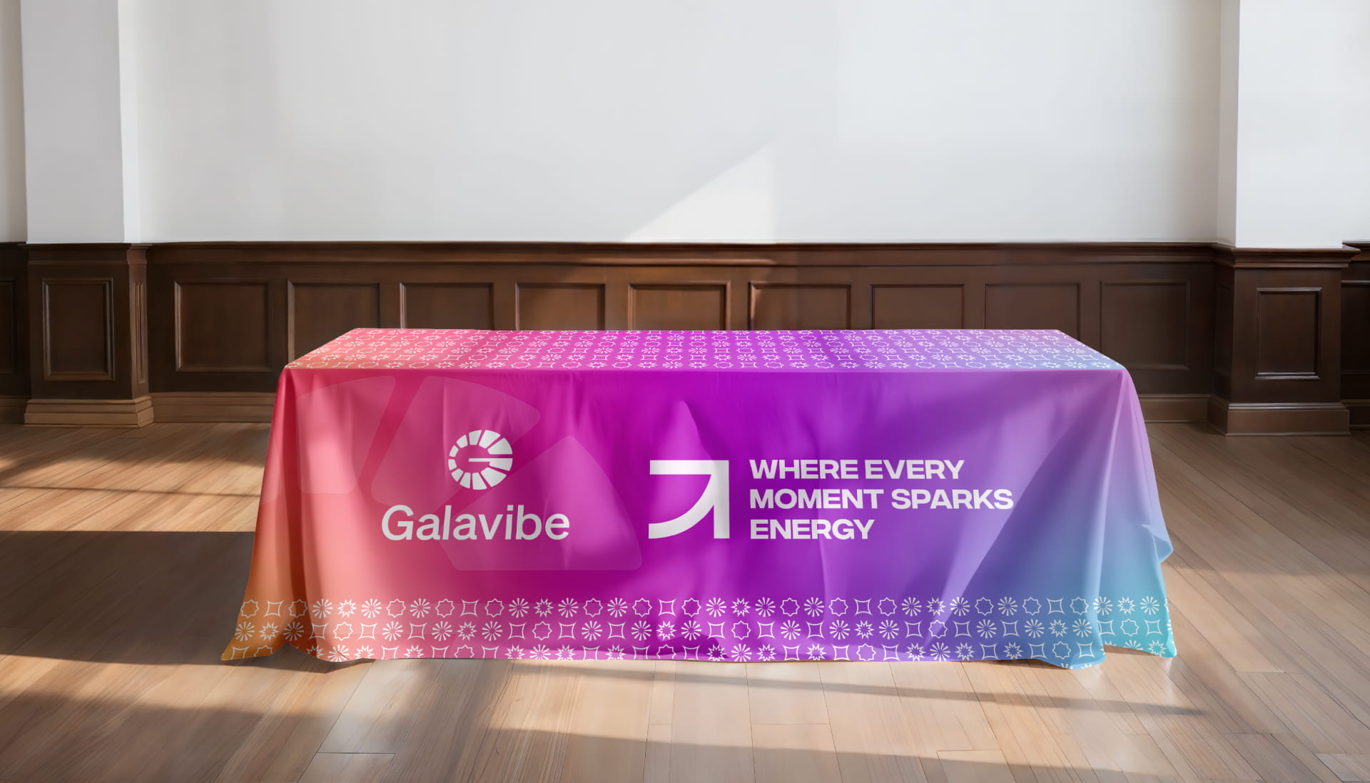
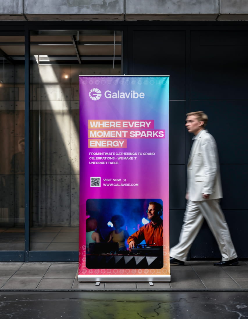
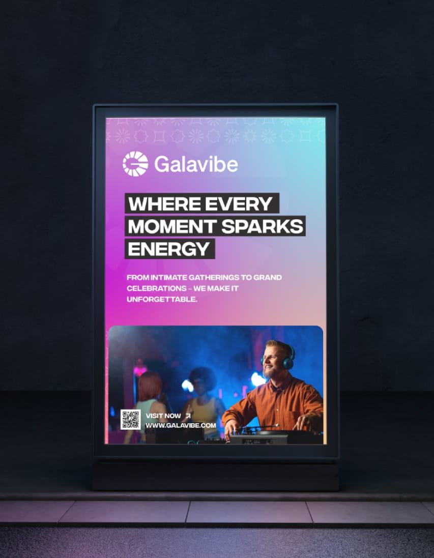
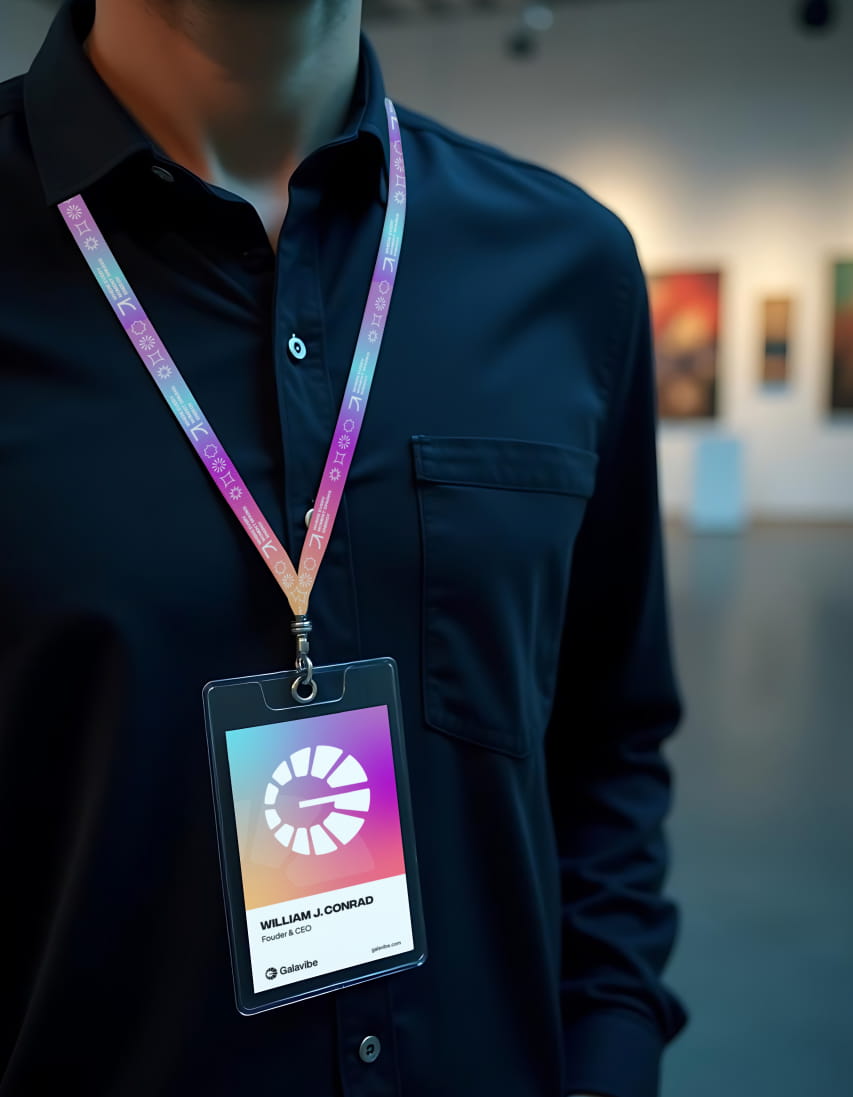
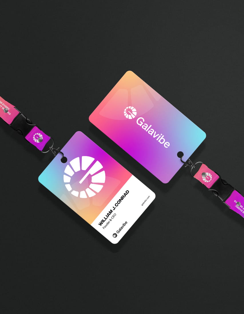
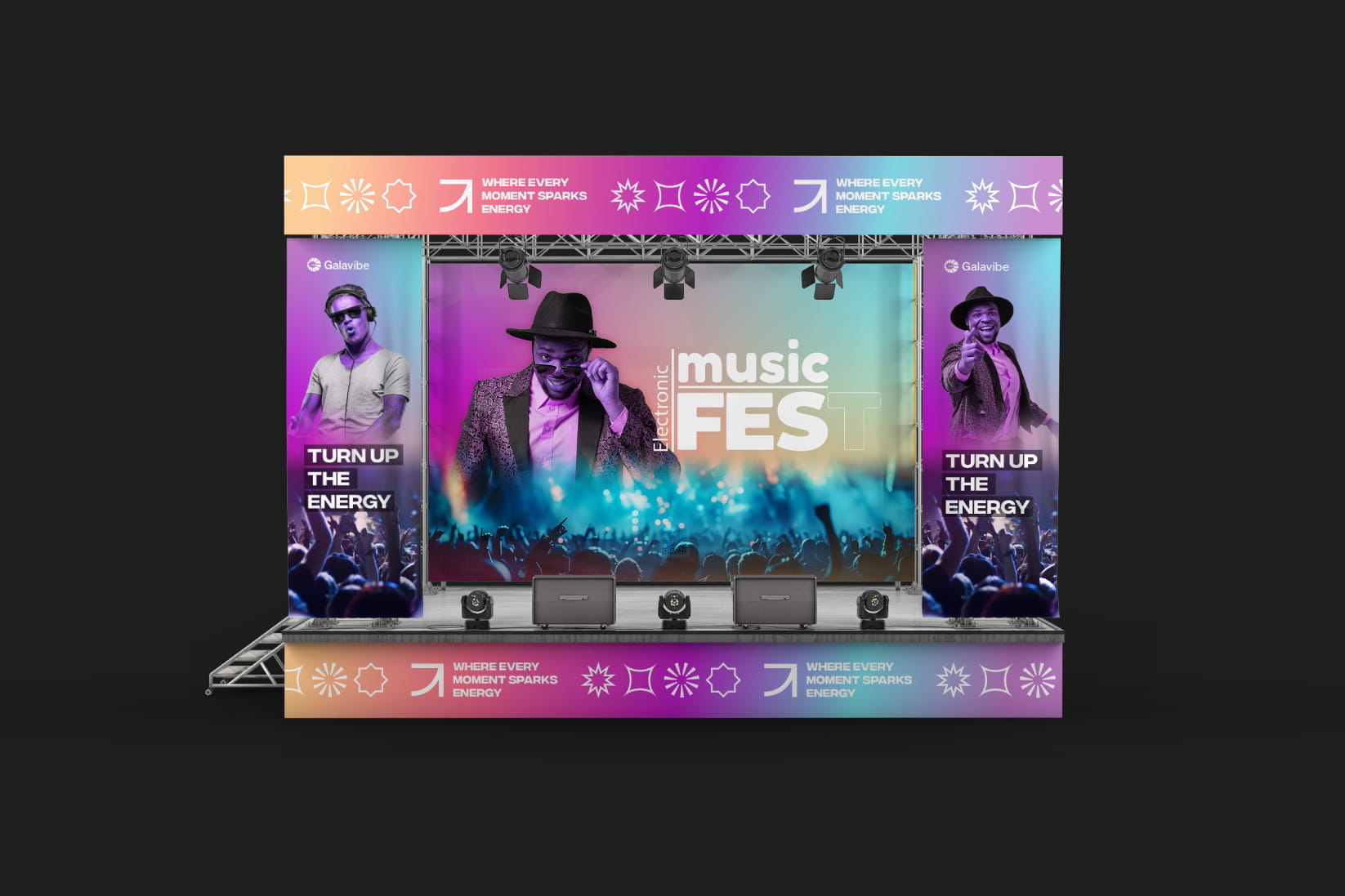
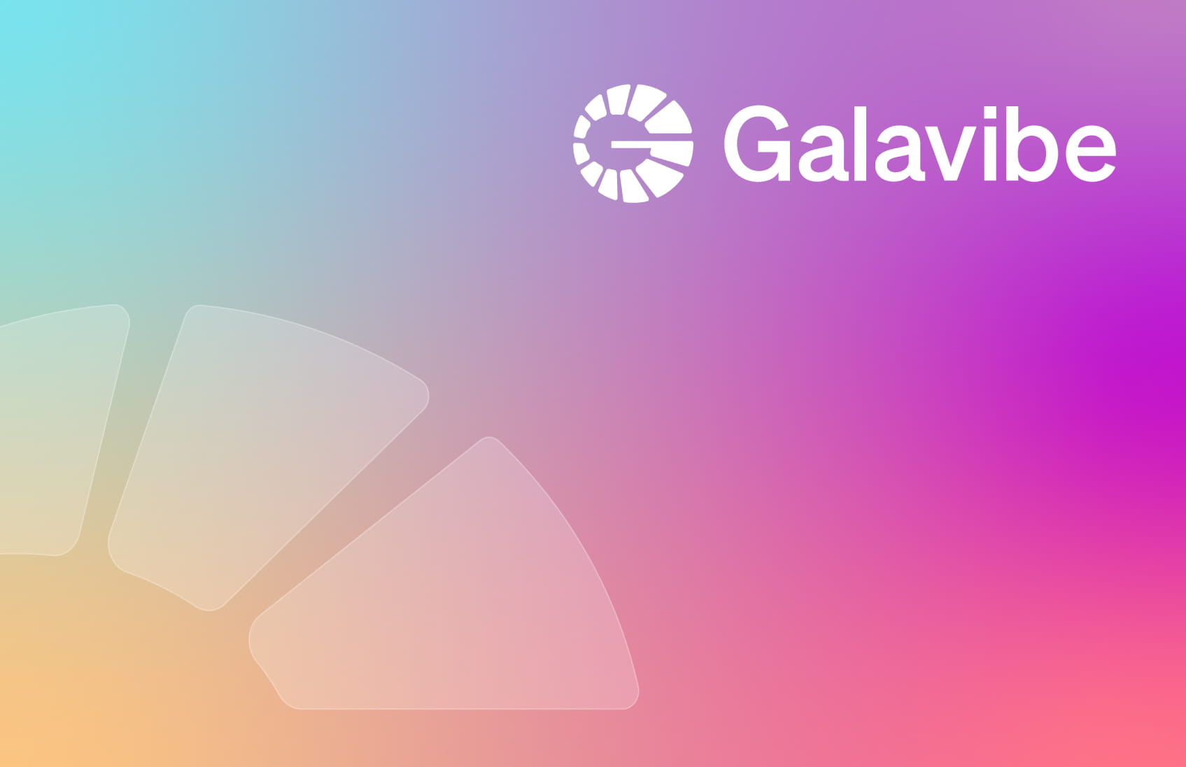
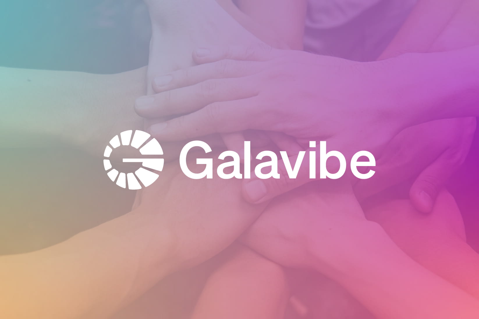
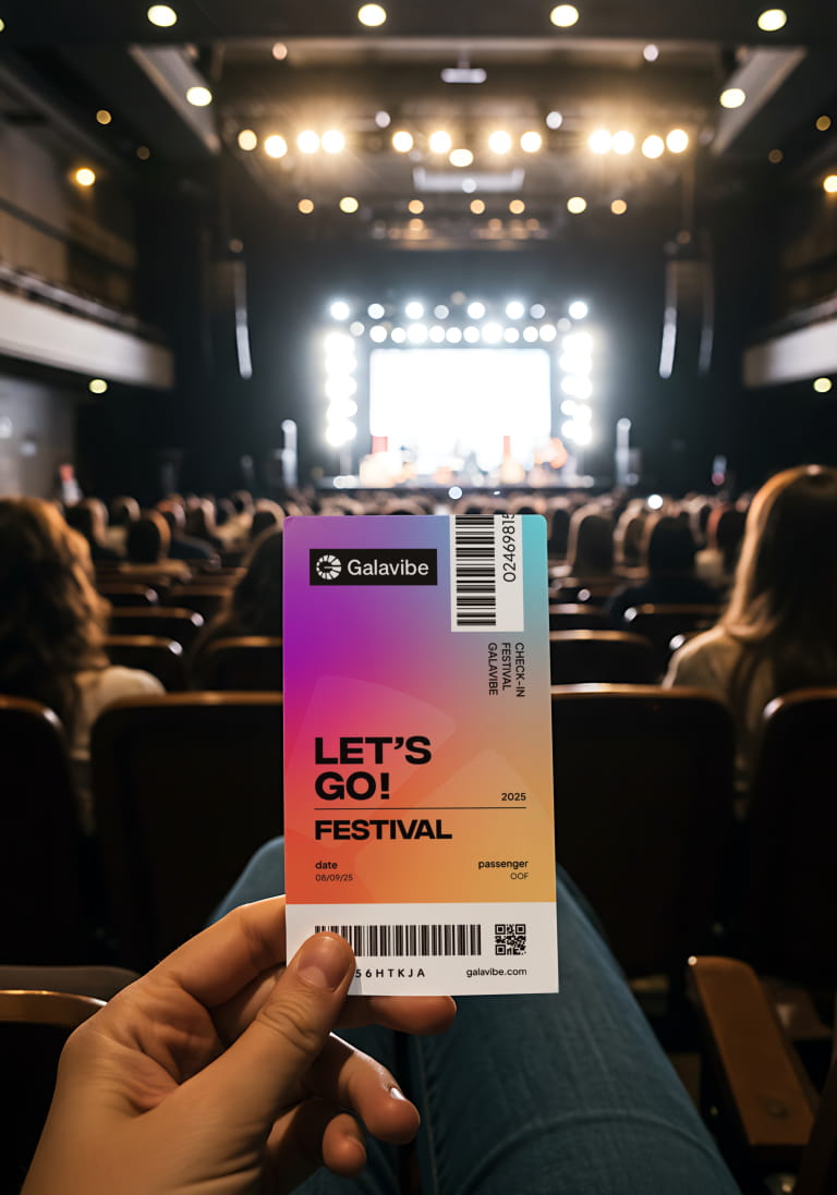
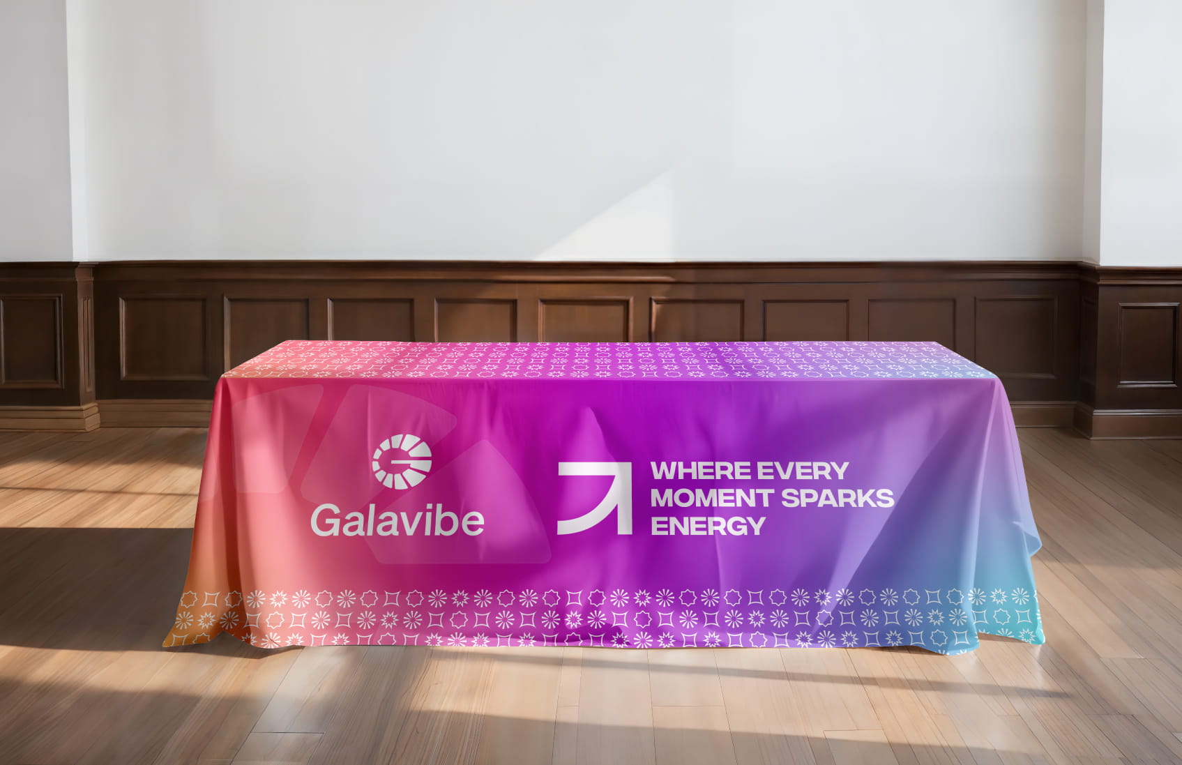
Our strategy centered on a "pulse" design philosophy. We developed a custom, high-impact typeface that mimics the movement and rhythm of sound, paired with a saturated, high-contrast color palette of electric purples, neon oranges, and deep night sky tones. The visual identity uses fluid, overlapping shapes to symbolize the merging of people and music, creating a modular system that is easily scalable from digital ticketing apps to massive physical event signage.
The final identity successfully positions the firm as a premium partner for global enterprises. By prioritizing a clean and authoritative aesthetic, the brand now aligns with the expectations of C-suite executives and professional planners. This cohesive visual ecosystem doesn't just look better—it builds the immediate credibility necessary to secure and execute high-stakes corporate contracts.
High-converting websites, cinematic video, and premium branding – all tailored to help you dominate your local market.